OpenPath
Overview and The Challenge
OpenPath helps businesses across the globe to handle transactions and fight against fraud. With its advanced technology, OpenPath is able to process and obtain a lot of data about each transaction and transform that data into digestible information for the clients to analyze.
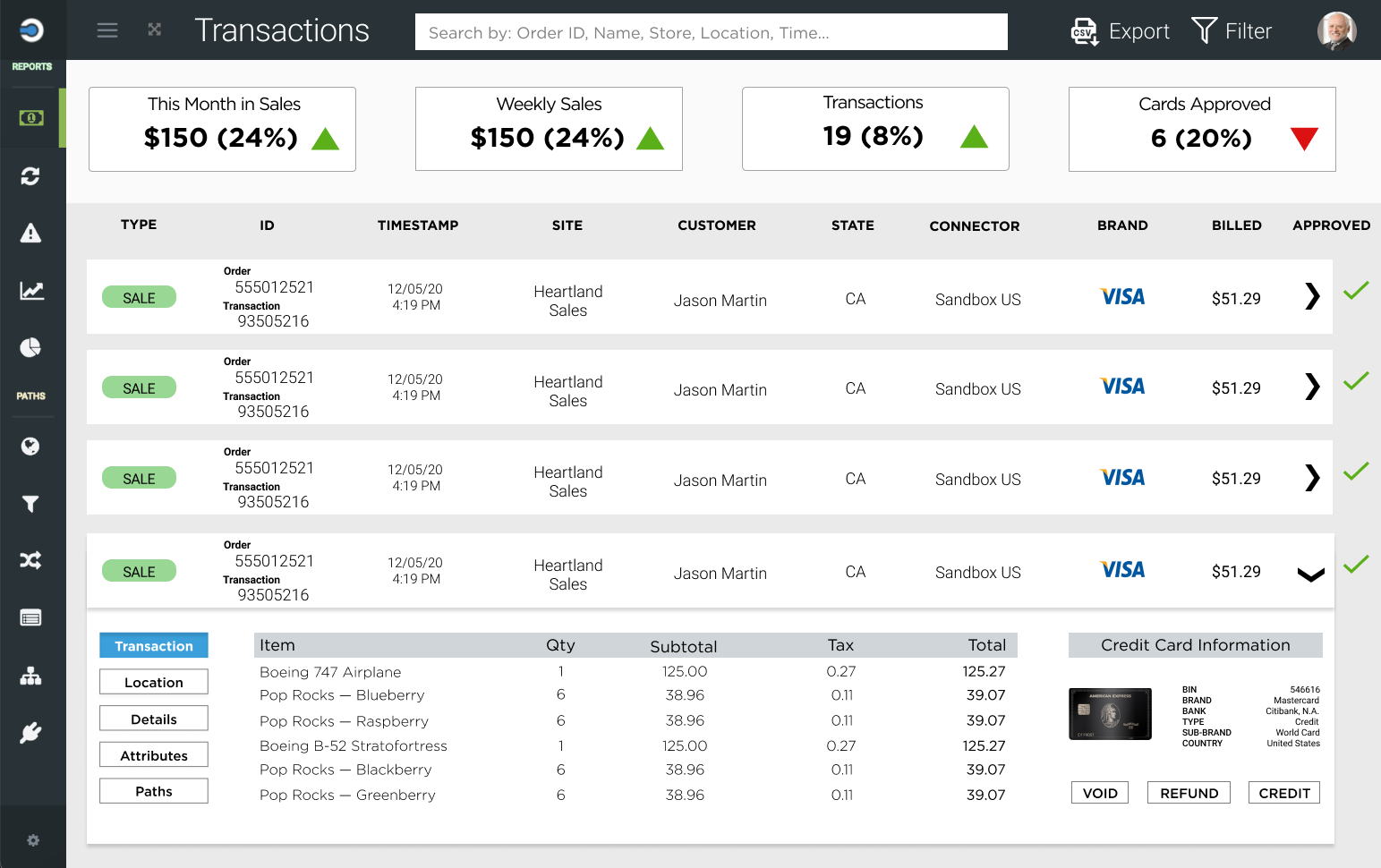
The challenge is to create an intuitive interface for the clients that will contain all the data that is being processed by OpenPath. The product has many features, but our task is to redesign the transactions page.
How it started
Our team consisted of 4 UX/UI interns at OpenPath. Our roles were similar across the entire UX/UI team. We all worked on the redesign and research of the product. We were presented with the current design of the website.
Key Problems
-
There is a lot of data that is presented all at once to the user without much context. Too much going on with a lot of different colors making the user overwhelmed.
-
A new user would find it difficult to understand the different iconography used on the sidebar.
-
The use of different colors confuses the user on which section should be focused on first.
The Research
We did not have direct access to the data that is being gathered by OpenPath in terms of the user research. Our research consisted of interviewing the CTO of the product and consult with the head of product design. We gathered the following insights:
The clients are professionals who understand the information provided
Businesses would prefer to use their own data analytics but need the data provided by OpenPath
Iconography is confusing which makes businesses avoid using the sidebar too often (requires more time to get used to the navigation of website)
The most visited section of the website is the transactions page
Methodology
Agile Methodology
We first identified the main issues of the current design of the website. From our user research, we found that even though there is overwhelming amounts of data, the users of this product are very familiar with all of the information and require that it is accessible to them at all times. We went through several design iterations, receiving feedback from the CTO and the head of the design product. We made improvements with every iteration until we landed on the design that solves all the challenges we set for ourselves.
Key Takeaways
-
At first sight, any UX designer would agree that the transactions page is overwhelmed with information. After our user research and intensive iterations of the design, we found that the clients are familiar with the data and rather keep the available information at a glance.
-
Websites are designed that there is infinite vertical space due to scrolling. The use of white space helps the user to digest the big amount of information more easily.
-
Color science can be subtle but plays a crucial role of how users interact with the product. Based on the user research, most of the clients want to know if the transaction has been approved. The green color is widely accepted as the color of acceptance, therefore we limited the choices of colors throughout the page and used very specific color to get the attention of the user.
-
When starting the redesigning process, as young interns we had a lot of assumptions based on our own experiences. We have never used such products but we made the mistake of assuming how it should turn out. After consulting with our supervisors and did extensive user research, we found that a lot of our assumptions were wrong.
-
After undergoing so many iterations of the design, we know that there are still things to be improved. Our goal is ultimately to make the product “perfect” for every user that is using the platform.


